Okay, I took a bit of a break from my tutorial writing, but have been encouraged to finish it off so here we go. Apologies in advance for my bad photography. I was just shooting with my iPad as I went along and a number of shots are out of focus. Here are links to the previous two tutorials I wrote, on pinning and painting horses.
I won't go into a lot of detail about brushes, washes and paints as I have covered that previously in my last post in these tutorials. My process for painting figures involves many of the techniques I use for the horses, but with less use of washes. Generally speaking I work with a darker base undercoat colour of the final colour, washes to sink into folds, the base colour and then a few highlights. It's a fairly speedy technique, designed to get the best out of my figures while aiming for a level of painting that will work well on the battlefield and allow me to finish armies rather than a few stands. Generally speaking, I can paint 24 figures in about four hours of painting, usually working in groups of eight to ten at a time.
Again, in these pictures I try to show my hodgepodge of paints used in each stage.
 |
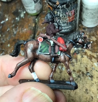
| In this case I start off with a base coat of a dark purply red (a burgundy mixed with black). I use this a fair bit for my undercoating for anything in the red/brown spectrum, in this case the red of the dragoons' coats. You can see the trumpeter received a base coat of light beige, as did the bread sacks on the backs of the riders. |
 |
| I also gave a coat of light beige to the breeches, which will eventually be white, and I painted the carbines brown. |
 |
| I use my raw umber ink to give a wash to the beige bits (breeches and bread bag) to darken the folds and underpainting. I don't really need a wash on the dark purply red as it is dark enough to serve as my darkest colour. |
 |
| At this point I start to paint in my mid-tones. I use an antique white on the breeches and a matte red on the coats. |
 |
My style varies depending on the colour. In this not-great photo you can see that with the white I will paint most of the surface, just leaving the darkness in the folds. (Sometimes I will even do a light dry brush of white first, but not on these guys as they are attached to the horse which makes that difficult.) With the red, I really concentrate on the arms, shoulders and back of the coat, leaving the folds and most of the front dark and painting around rather than over, the belts and gear.
| Not visible here but the bread bag at back received a mid-coat of beige on it at this point, with a few lighter beige highlights. |
Finally I have mixd some pure yellow with the red to brush on the upper parts of the arms, shoulders and sometimes butt of the rider - places that would catch the light. |
 |
| Yikes, a worse photo, but all I have. The trumpeter gets the same treatment as the breeches above, leaving the dark colour in the folds. The white can look a bit ragged at this stage but that is softened by a later wash of ink. (I think the yellow you see on the white is just light in the photo.) |
 |
The next step is the painting of the details - facings, collars, cuffs, epaulettes, webbing, etc. I use a pure solid Vallejo white for the braid and belts, a colour that I don't knock back with washes, as I do with the breeches (later) or the white if I was painting an all white uniform. You can see how you don't really miss the red under the braid as the braid would be casting a lot of shadow anyway. Here you can also see how the negative space left unpainted for the folds of the coat on the arms works more organically than trying to paint that darkness after the fact.
|
 |
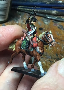
Here are all of the dragoons with their base colours and details applied. I like leaving faces until close to the end, for no other reason than when you add the flesh they come alive, which is always a bit magical. Like leaving the best for last on your plate!
|
 |
| Here he is with the flesh applied. My flesh looks a bit light here - I actually use a Vallejo medium flesh. |

|
| At this point I apply washes. The face receives a wash of raw umber and a brown red ink mix and the breeches a very, very light wash of raw umber with the smallest bit of a transparent raw sienna (a yellowy ink), that makes them look less freshly laundered and more worn. It also sets that white off against the white of the facings, braid, webbing, etc. |
 |
| A few more touches at this point. I take a lighter flesh (actually Vallejo Dark Flesh, which for some reason is lighter than my medium!!) and pick out with a small brush the cheeks, chin, nose, tops of ears, back of hands and fingers. The brass chin strap (I had left the strap dark when painting the flesh to set it off from the face) gets painted. |
 |
| Here is a group shot with the flesh colours and inks I applied for the above stage. |
 |
| A close up of the bugler with his flesh and some of his details painted. |
 |
| The final stage is really just a continuation of detailing. At this point I paint all of the blacks and then use a small brush to add a few grey highlights on the black. You can see it on the knee of the tall boot, the stirrup strap, on the edges of the bicorne and generally a highlight stroke either side of the bicorne in the centre. Scabbard and sword get painted as does the plume and the white chevrons on the sleeve with a brush I have that has about six bristles and I only use for something like this. |
 |
| One final group shot showing the paints used in this final stage. The blue was for the canteen. |


Nice, I have the same unit in 28mm from front rank. Just doing the last British cavalry unit for Talavera myself, 23ed LDs.
ReplyDeleteThanks, Tony. I have seen those Front Rank Dragoons - they're nice-looking minis! I still have a regiment of these to paint for the Talavera scenario, 3rd Dragoon Guards, and the 23rd LD's as well!
DeleteYou have really made a silk purse from these *okay* Hat figures Bill. Top painting, as with the other units in your recent posts.
ReplyDeleteRegards, James
Thanks, James. Yes, the set was a disappointment and is super fussy to put together!
DeleteBessiere here, thanks for taking the effort to provide your tutorial. I understand better what you meant by negative space in that you are using the undercoat as the shadow layer. Black is too extreme which is the reason I don't like using that for a base layer but by using very dark colors it becomes much more agreeable to the eye. The same principles you explain will work just as well for a French or Austrian army as it does for British. For 1/72 scale I think your approach is perfect for gaming figures. The right amount of detail to delight the eye but not wear out the painter. Well done Bill!
ReplyDeleteCheers,
Bessiere
Thanks, Bessiere I'm glad this was helpful. The thing about negative space only occurred to me later, but I think it is apt. And I agree, black outline can be very harsh but the darker colours work well when they are allowed to come through and the principle works well with any colour scheme.
Delete